Tuesday, December 28, 2010

Christmas Painting


Every year I create a Christmas painting and every year, I think that particular painting will be the last one. Mainly, this is because of the pressure and stresses caused by procrastination, which I have honed to a fine art in itself. Luckily, new ideas keep emerging and as unlikely as it may seem, I already know what to paint in 2011. So, maybe I can actually get it painted before the very last minute!

Last year's painting featured our grandson, so this year's subject is our granddaughter. Working from a photo, I edited the scene to emphasize the girl, the tree, the blue and white pottery and the reflection on the top of the chest.

Sunday, December 19, 2010

Plein Air in Georgia


Last year I started plein air painting and this painting of a slave cabin on St. Simons Island, Georgia was one of my first attempts. My artist friend Susie Burch, set me up with a list of all the outdoor artist's gear required and a list of all the accessories that actually are quite mandatory here in the South: bug spray, sun screen, a hat! and an umbrella to attach to your easel. To top it off, she invited me to our own paint-out on St. Simons Island for a week. Now that's a great introduction to plein air painting.


I painted this scene of a garden gate at the old Bulloch Hall Plantation here in Roswell in two mornings this past June. In looking back at these two paintings, I can see an improvement in some areas. The first St. Simons painting I like better because of the looseness of the brush strokes, plus I took the artistic liberty of making the roof color more terracotta which was a great contrast to the moss-covered oaks. Other than the palms and Spanish moss, you might mistake this for a charming English cottage. It's quite lovely now, but I imagine it was much more utilitarian during antebellum South. The old plantation house on St. Simons is gone now and all that's left on the grounds are majestic live oaks draped in moss and a few old slave cabins like this that are now maintained by a local garden club.

However, in the second scene, I'm even more pleased with capturing the light. This was done on a couple of sweltering mornings on the grounds of Bulloch Hall and looking back on the experience, I'm so glad to have caught the light on the tops of the trellis gate slats and on the tops of the posts. You can tell that I spent a lot of time (maybe too much time) getting the perspective right on the gate, fence and outbuilding. In retrospect, the lines are a bit rigid and I missed the loose quality of the earlier painting. On the other hand, I like the lightness of the leaves and the bark in the foreground tree. The bark has an almost fluid quality in the brush strokes. This plein air painting was done on a canvas toned with cadmium red, which unifies the painting and makes those greens pop.

Overall, I like both these paintings and remind myself that this is a process. Once you lather up with bug spray, swat the flies away, resign yourself to the heat, you lose yourself in the painting process. My wish for the New Year is to do more and more plein air painting in addition to the 5-6 studio paintings that are now residing in my head and begging to awake on the canvas.

Thursday, November 18, 2010

Update on Savannah's portrait

This portrait of Savannah is coming along pretty well now and you can see the details in the hat. Her face is nearly done, but I see some changes that need to be made. Nothing is harder for an artist than capturing the exact likeness and I could be tweaking this for weeks, but there are more paintings to do in the meantime.

Wednesday, November 3, 2010

Savannah in her Party Hat

Savannah in her Party Hat is in progress now---I have about 6 hours in so far and it's starting to come together. The original photo included my grandniece Savannah from the waist up, a lovely photo, but for this portrait I decided I wanted to focus on her face and cropped the photo as shown. After making that composition decision, I was very uneasy about it, even after sketching it on the canvas. In fact, I put off starting the painting for a week, just mulling it over. I don't like to start a painting feeling that kind of uncertainty about the composition. However, I decided that rather than scrapping it and going back to the half-figure photo, I would go ahead and do an under painting. As soon as the painting was washed in, I knew it would work.

The background is subtle and muted. The dress and hat pop with color and the expression on Savannah's face is what made me want to paint this one. For background on this one, several months ago I had a formal, dress-up tea party for my friends, niece and grandnieces (3!). As part of those festivities, we had a variety of hats, ribbons and fresh flowers so everyone could choose and decorate their own hat for the party. Each of the girls posed for pictures in their hats and I have in mind that a series of paintings is in order. This is the first in the "Girls in Hats" series.

In coming back to this painting, you will notice the shadows on the girl's face under the hat are not as dark as in the original photo. That's deliberate as I wanted to show more details in the eyes and upper face with color rather than contrast. My favorite art teacher Chris DiDomizio would always ask, "What is this painting about?" So this painting is not about contrast, about deep and light values, but rather it's about color and a lighter mood. After all, it's a party!

So, in the original photo, the contrast between light and dark was so great that you couldn't even see the shades of color or reflective light in her eyes. In the painting, that's visible. I also took the liberty of filling in a tooth that just exists as a budding tooth. After all, that tooth will grown in and better to have a complete set of teeth for posterity. I mean seriously, isn't that what we all want?

Another 4 hours and it will probably be done. I need to add more green to her face--yes, that's what makes flesh tones real. Her arms and hands need more color and definition. Her hair needs to be filled in, smoothed out and at the very end, I'll add some silken strands of hair floating at the edges. The hat will need more details, too, and I have no idea how I'm going to loosely replicate the weaving of the hat. After all, I don't want to spend too much time on details that draw the eye away from her face. I'll add more dimension to the flowers in the hat, too, with lights and darks, keeping the details very loose.

Sweet Savannah.

Wednesday, October 20, 2010

An Evolving Composition--Still Life with China, a Bird's Nest and Oranges


Sometimes I start a painting with a composition fully formed in my mind, only to discover through the process that my original idea wasn't working and modifications were needed. In this case, editing the composition was necessary to draw the view's eye into the painting without too many distractions.

The original idea was to create a simple still life with a blue bird and fruit. So, I gathered props from around the house, including blue and white porcelain, fruit and an arrangement of ferns, ivy and a bird's nest---some of my favorite decorative items. Then I set up several compostions with these props and photographed them. This way I had a variety of arrangements to consider and looked at each one with the plan to add a blue bird to the mix when I sketched the composition on canvas.

Then I ran into problems...artistically speaking, I don't like to copy another artist's work. Copying a great artist's work is a wonderful way to learn color, composition and techniques, but I want my own work to be as original as possible. Knowing that another artist in the Northwest uses a western bluebird as a signature motif in still life paintings, I didn't want to copy that. At first, I thought that using my own props and creating a more complex scene within the still life would be enough to overcome any similarities to another artist's work. However, as the work moved forward, I still wasn't happy with the overall scene. It seemed too busy for the space.

First I laid in an underpainting for the blue and white vase and then painted the design over that. Next, I painted the oranges and china leaving the bird's nest and greenery for last. I had originally planned to paint the bluebird standing on the edge of the nest, but as the painting evolved, I discovered that the composition felt complete as it stood. As in life, things don't always go as expected or planned.

To my eye, I'm drawn first to the brilliance and color of the oranges, then to the blue and white vase and finally to the bluebird eggs. Eggs are a promise of new life, new beginnings and hope for the future. So, I'm calling this one good.


Saturday, September 4, 2010

Starry, Starry Night.....


We recently visited the Monastere St. Paul de Mausole in St. Remy de Provence, France which was an insane asylum in the late 19th Century and is presently a psychiatric hospital. The most famous patient there was Vincent Van Gogh and today you can walk the beautiful grounds and see the room where Van Gogh lived for a little over a year. During that brief time, he painted over 140 paintings---one of which is the now famous "Starry, Starry Night."

http://www.avignon-et-provence.com/saint-paul-mausole/

While his bedroom is small and sparsely furnished, the view from his window is beautiful, overlooking the gardens, fields and Provencal countryside, complete with the twisted trees shaped by mistral winds. So, considering the bleakness of psychiatric care in the late 19th Century and treatments that Van Gogh endured, I couldn't help but think about the paintings--the many, many paintings he created here. And I couldn't help but think about what that process must have brought him intellectually and emotionally.

There's something transcendent about the process of making art. Virtually every artist I know has experienced being in that very different state of mind. The creation process is invigorating and absorbing. The level of concentration is so complete that you can lose track of time. Someone can talk to you and you miss what they're saying.

Once a friend and I painted en plein air five days in a row, morning and evenings each day. We were so immersed in the process, that we found ourselves having trouble expressing ourselves in words. How weird is that? We concluded that we were spending so many hours per day in the right brain, that our left brains were having trouble connecting.

So while we walked through the Monastere St. Paul de Mausole, I found myself absorbed by thoughts of Van Gogh's process. I don't think of his paintings as an expression of his mental illness, but rather as an expression of the part of him that was whole. While you need determination and practice to create the paintings you imagine in your mind's eye, there's also tremendous satisfaction in completing a painting that meets your own expectations.

Because of the brilliance of his work, there will be speculation about Van Gogh's mental state for centuries. Books will be written and dissertations published--all about a man who never saw success in his lifetime. I like to think that the process of painting gave him the best moments of his life.


Monday, April 19, 2010

The Boy with the Spoon on his Nose


Art should give the viewer something to think about, but sometimes art can give you a laugh, too. "The Boy with the Spoon on his Nose" does that for me.

Susie Burch is a fellow Atlanta painter and good friend of mine who painted an hilarious painting of a chicken and chicks running. The title? "Run for your Life!" The motion in that little painting is so real, you can practically see feathers floating into air as the hen and chicks scurry across the canvas. Check it out here: http://www.susieburch.com/assets/gallery_oils/index.html by scrolling down the series of paintings on the left. Makes me smile every time I see it.

I love the expression on the face of the boy with the spoon on his nose. He's clearly delighted with his balancing trick and so is the viewer. It makes you want to pull a spoon out of the drawer and try it for yourself.

The boy was wearing red in the original photo. Somehow, I think the overall impact would have been lessened with a more subdued color. After all, this painting is about spontaneity and youth and happiness. I seem to be using red consistently in my paintings these days. I even put splashes of red in the background to move the viewer's eye around the painting. The people and furniture in the background are pretty loosely painted and I used some cool grays to balance the warmth of the red.

Overall, it's working for me, but you never know....I may come back to it in a few weeks and see fifteen things that need tweaking. I have one particular painting in my home that I've been tweaking off and on for two years. Enough already!


Sunday, March 21, 2010

The Completed Painting


The painting of Ava at the Rock of Cashel in Ireland is finished. This painting's quiet moment is a rarity in Ava's life.


Ava is now three years old and has recently moved to Sydney, Australia. While she still declares herself "a Boston girl," her Boston accent is turning to an Aussie one. No more talk about "boids or Hahvid." Her Australian grandmother writes that Ava "has grown in height and language skills, gathering enormous speed and can gallop with the pony tail flying out the back."


When I last spoke with Ava on Skype, she was wearing her pink and white polka-dotted bathing suit and jumping up and down on the bed while we talked. She was a pink and white polka-dotted blur. This is what life is like when you're three.

Friday, March 12, 2010

Thoughts on Composition


My current work in progress is a painting of Ava at the Rock of Cashel in Ireland. As seen here, the painting is about 90% finished. Even as I compare the original image with the painting, I'm pulled in about ten different directions thinking about how I'm going to finesse this. "Wait, her cheek is too rosy and the top of her head too pointy. Oh no! I need to put more tinted raw umber in the background....and that shade of tealy blue in the rock can not possibly ever occur in nature." An artist's self-critique never ends and that's part of the creative process. But, I digress. This is, after all, supposed to be about composition and how this particular painting has evolved.
As soon as I saw this photo last summer, I knew I had to paint it. There's something so delicate about Ava's features here and the backward glance at the viewer, captivating. What is she pointing towards? Is she merely curious or concerned? I like a painting that leaves those answers to the imagination.
My first intent was to delete the outdoor furniture from the background, uncluttering the painting, so the eye is drawn more to the focal point, Ava's face. Luckily, what remained in the photo is compelling---an old stone grotto, a stone wall, and new grass pushing it's way up through fallen leaves from the past autumn.
I wish I could say that I immediately relied upon an ancient formula for composition, using the Fibonacci sequence and the Golden Mean to determine the precise location of my focal point on the canvas. However, the truth of the matter is not so lofty. In fact, it was pretty haphazard.
First of all, I just happened to have a square 20x20 canvas already primed and a frame to go with it. Double bonus! As soon as I finished the sketch on that square canvas, there was no denying my mistake: it was a bad, bad composition. Ava's head teetered up in one corner of the canvas, and the background was so cramped, all you could really see was her figure.
In a case like this, it's better to cut your losses and go back to the beginning. Who wants to spend time and energy working on a painting doomed from the start by poor compositon? So, I chose a rectangular linen canvas 22x28 and started over again. This time I roughly divided the canvas into thirds horizontally and into thirds vertically, placing Ava's face approximately in the sweet spot, the Golden Mean. Well, okay, it's off by an inch because I had to look at the overall composition and not place her body too far to the side of the painting. Still, her face is roughly 1/3 from the top of the canvas and 1/3 from the right side of the canvas. Close enough and I like it.

Tuesday, February 16, 2010

The Golf Course President


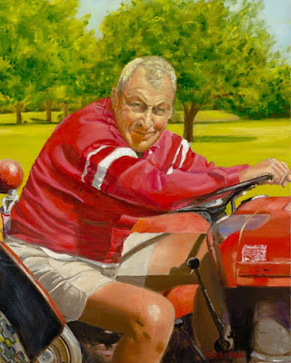
I painted this portrait of my step-dad Bummie several months ago. He's the president of a golf course in Ohio, a course he and his family founded 50 years ago. In planning this portrait, I wanted to capture the essence of this man's spirit, his good nature, his kindness and his work ethic.


Many times an artist doesn't know the portrait subject well, so painting Bummie was especially rewarding. He's a remarkable man. Raised on a farm in Ohio, he went on to college and after graduating, he went into the Army during World War II. His German language skills were a determining factor in his being sent to the Normandy shortly after D-Day. Most of his fellow trainees went to Pacific theater of conflict instead and few survived. Bummie served under General Patton as a forward artillery observer--not a position with a long life expectancy either--and saw action through Normandy and through the Battle of the Bulge. Before the war ended, he went on to serve with the troops who liberated the Dachau concentration camp.


After the war, Bummie stayed in Europe and did graduate university work before coming home to marry Ruth and raise four children. His first child passed away as an infant and his wife Ruth passed away at a young age, too, leaving Bummie a widower with four children. During these years, he helped create the golf course while teaching and later counseling high school students.


When I was a teenager, my mother Marilyn and Bummie married and they raised his four children along with my brother, sister and me. Imagine raising seven children, five of us teenagers at the same time. I shudder to think....

During all those years, Bummie worked at the high school during the school year and worked on the golf course weekends and summers. Besides working, he taught Sunday school and was active in the community with numerous civic organizations. When Bummie retired as a high school guidance counselor decades ago, he just turned his summer job on the golf course into full-time work. He turned 90 this past summer and it was the first year he didn't drive tractor and work full-time.


So when I thought about how to do Bummie justice, I wanted to show him in day-to-day life. He's a humble man and very down to earth. Instead of painting a more formal portrait, I chose a photo of him at work on the golf course, on his trusty tractor, just stopping by to say hello.

Setting the composition, I took an old photo of Bummie on his tractor and cropped it tight, exposing just enough of the tractor to set the scene and to bring the focus to the man himself. I admit there's a whole lot of red in this painting, just as there was in the original photo. Normally, I'd edit out some of that red since it's so dominant and draws the viewer's eye away from the face. However, for this particular subject, the red was appropriate as it's Bummie's favorite color. Somehow, even with all the red, it works...especially against the green of the golf course in the background.

Capturing the true likeness in a portrait is the crucial factor to a successful painting. Sometimes I've been known to slim people down in their portraits, erase a few lines here or there and just generally try to present people in their best light. The more I worked on Bummie's face, the more I wanted to capture every line and every crease, the crinkled skin at the corner of his eyes, the lines on his forehead, the strength of the nose, the softness through the jaw line. I'm guessing he was in his late 70's in the original photo.

So, all this realistic painting of a 70++ year old face does bring to mind our culture's emphasis on beauty and youthful beauty at that. How many times have I looked in the mirror at my own ever-changing face and thought, "if my forehead falls any further, my eyebrows will be on a line with the bridge of my nose." The puffiness over my eyes signal "you know you could get your eyes done...a little nip here, a little tuck there." And those creases in the cheeks and on the forehead..."wonder if Botox might help?"

However, Bummie's face doesn't bring any of those thoughts to mind. His face snaps me back to reality. Here's a face that reflects all the hardship, all the joys, all the struggles, all the accomplishments. His is a beautiful, authentic face in the fullness of life.

So, this year, in a few short months, it will be spring again in Ohio and Bummie can get back out on his beloved golf course on a golf cart. If you see him out, stop and say hello. He's the kind of man who always takes time to talk....and to listen.

Wednesday, February 3, 2010

On painting the departed....


For the past few weeks, I've been working on a portrait of my great-niece and her mother who passed away three months ago. My niece asked for a portrait of her mother so she could see her mother's face every day. That's more than enough incentive to attempt your best work.


This project has been challenging in a number of ways. After looking at photos of this young woman, none of the pictures of her alone captured what I wanted to portray. I settled on a picture of the mother and child together. It's a very casual photo with my great-niece sitting on her mother's lap. Her mother leans to the side to smile at the photographer and the girl's eyes are looking to the side towards her mother. Very charming, I thought.


Sketching the mother was the hardest part of the entire process---which suprised me. I would have thought it might be more emotional as I saw her face emerge from the canvas in paint, but I found myself tremendously saddened as I sketched her face, her eyes, her smile. What a loss. What a tragedy. I want this portrait to convey the young woman in a happier state and show the bond between mother and daughter. It's quite something to think about a young child only being able to see a painting of her mother every day rather than the mother of flesh and blood.

So, surprisngly to me, the process on this particular painting has been a positive one. Above, I've posted a picture of the painting in process and eventually will add the original photo and the final portrait. First of all, I wanted this painting to be about the people and have simplified the background, deleting the background of the original photo and painting in a loose, shadowed grey/teal wash. I also changed the colors of clothing to a more subdued palette---all this with an intent to focus on their faces. The finest details of the painting are in their faces, especially their eyes--all in an attempt to draw the viewers gaze there first.

Painting is a joy: mixing the palette, placing the first details, seeing a face come to life. Generally, I start with the cheeks and nose, laying in the underpainting of shadow and placing the features. As I build on the underpainting, placing lighter and darker values to define the face, the subject begins to emerge.

With this particular portrait, I started with the mother's face and had that fleshed out in a few hours, but hadn't added the eyes. While my first thought was to wait to paint her eyes the next day when I was rested, I discovered that I couldn't stop painting until her eyes looked out from the canvas. Only then would I know that this painting could be good.

As the painting progressed, I found myself thinking more and more about this lost young woman. Would she like what I had created? What will happen to this painting over time? I imagine that my great-niece will keep it with her throughout her life...at least I like to think so. Maybe someday she will have children of her own and this is how they will know their grandmother. Interesting, not to mention rewarding thoughts for an artist.